MeSaran.in, a personal website of Saravanan, a Bangalore based UX designer with over a decade of experience in branding, print and digital product design. This website gets separate sections for featuring work, personal details, hobby section and contacts. Last major update was done around 2007, only bug fixes and minor functional updates are done since then.
Problem statement
MeSaran.in is getting old and it is no longer seen as a website that people used to refer for inspiration. The design, typography, color scheme are losing its place and this need to be addressed to stay on top of UX game. As the existing website (MeSaran 2.0) is partially powered by wordpress, the new one should be fully WordPress driven but should not look like a blog but like a website instead.
Along with the above challenges, the UX need to be cheerful and innovative… A target I set for myself as this facelift is supposed to elevate my visibility. This new website will also have switchable mobile version as our mobile userbase is growing at a rapid pace.
Social network integration is also one of its key expectations as the owner(me) is quite excited to be in these platform and also very active.
Users and audience
This website is targeted at recruiter, who are looking for an UX consultant or UI developer. This website will act as showcasing platform to show capabilities that are not limited by external factors. The secondary audience includes UI/UX designers who are looking for inspiration and guidance.
Roles and responsibilities
I, being the one involved in this face-lift exercise, I played a role of UX developer, Usability/accessibility consultant, visual designer, UI developer, content developer, tester and web master.
Scope and constraints
Because this product is for an UX consultant, showing almost skills in the UX design and UI development is of paramount importance. There were lot of new requirements like the switchable mobile UI, WordPress integration and visuals to impress even the best UX designer are all adding up to be a challenge bigger than what was initially anticipated. Me being a UX consultant comes in handy but i cannot do this for ever so decided to do this entire facelift in 45days.
Identifying the issue
The website MeSaran.in is a website that gets considerable number of visitors since its inception in 2007. The analytics data coming of Google analytics has given us evidence that more and more users are moving to mobile devices and even better chunk is moving to modern browsers like Firefox and Chrome mostly from US and India.
In the past 6 months there is a substantial decline in page visits and the engagement is coming down gradually. Some of the pages are getting very minimal visitor like the “My Career & Tracks” and “My Resume”, which clearly says that users are no longer interested in these contents or the way these are presented to them. The other parameter that our (me and other freelance friend) initial findings showed is lack of clarity on what this website is all about, so user land up here by mistake due wrong SEO algorithm.
Factor contributing to the decline in user engagement
In house SEO played a bigger part in bring irrelevant users to the website and this caused major decline as Google figured this pattern and redirected to other relevant sites. The keywords used and content writeup pattern is major contributor to this anomaly.
Second major factor causing this fall is the UI is no longer exciting the user to stay back, explore the features and its implementation patterns. What was once considered benchmark (like interactive response on hover) no longer serves any purpose as touch screen devices become more popular over time.
Finally, the competition, which is fierce as domains names become cheaper, more UX designer are finding it easy to put up their work online. We no longer have that early bird advantage and need to get into that ring and fight it out.
Our action plan
The SEO trouble is the easiest of them and took very less time to fix, with a help of some friends in that space. I was a part of a firm (Sapient Corporation) that does digital transformation, so finding a SEO specialist to consult is not a big task. Some keywords and content updates improved the engagement ratings, this update was done even before the visual redesign even started.
For the other two issues, we made a total facelift starting with visual design, typography, content and even the sitemap. Some pages are removed, some content is moved alongside others and some got more emphasis either by hierarchy or by visual elevation.
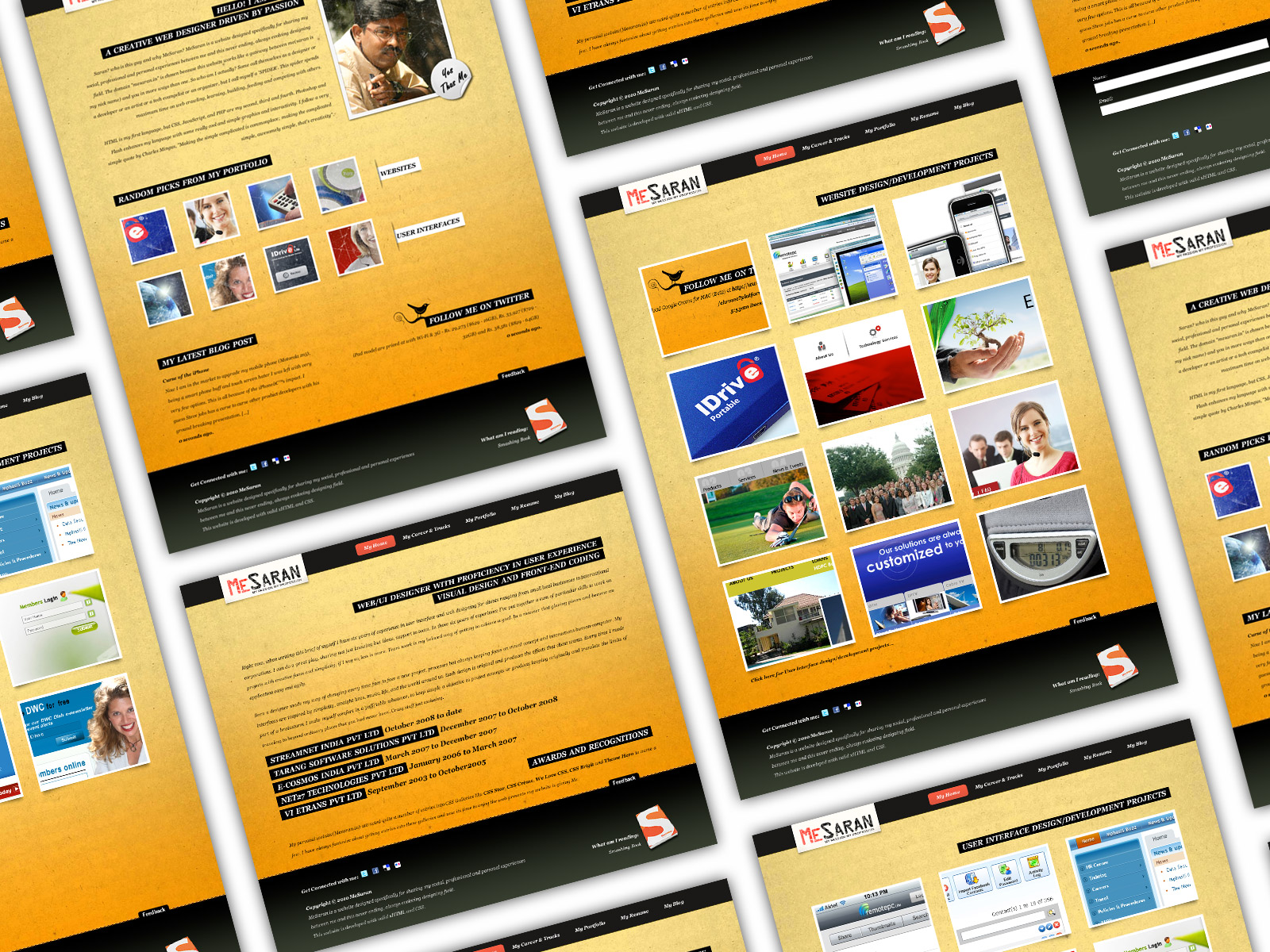
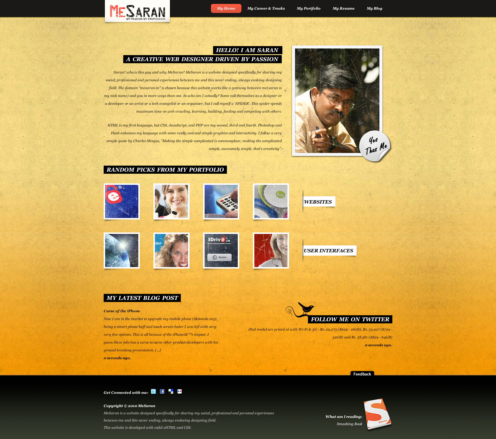
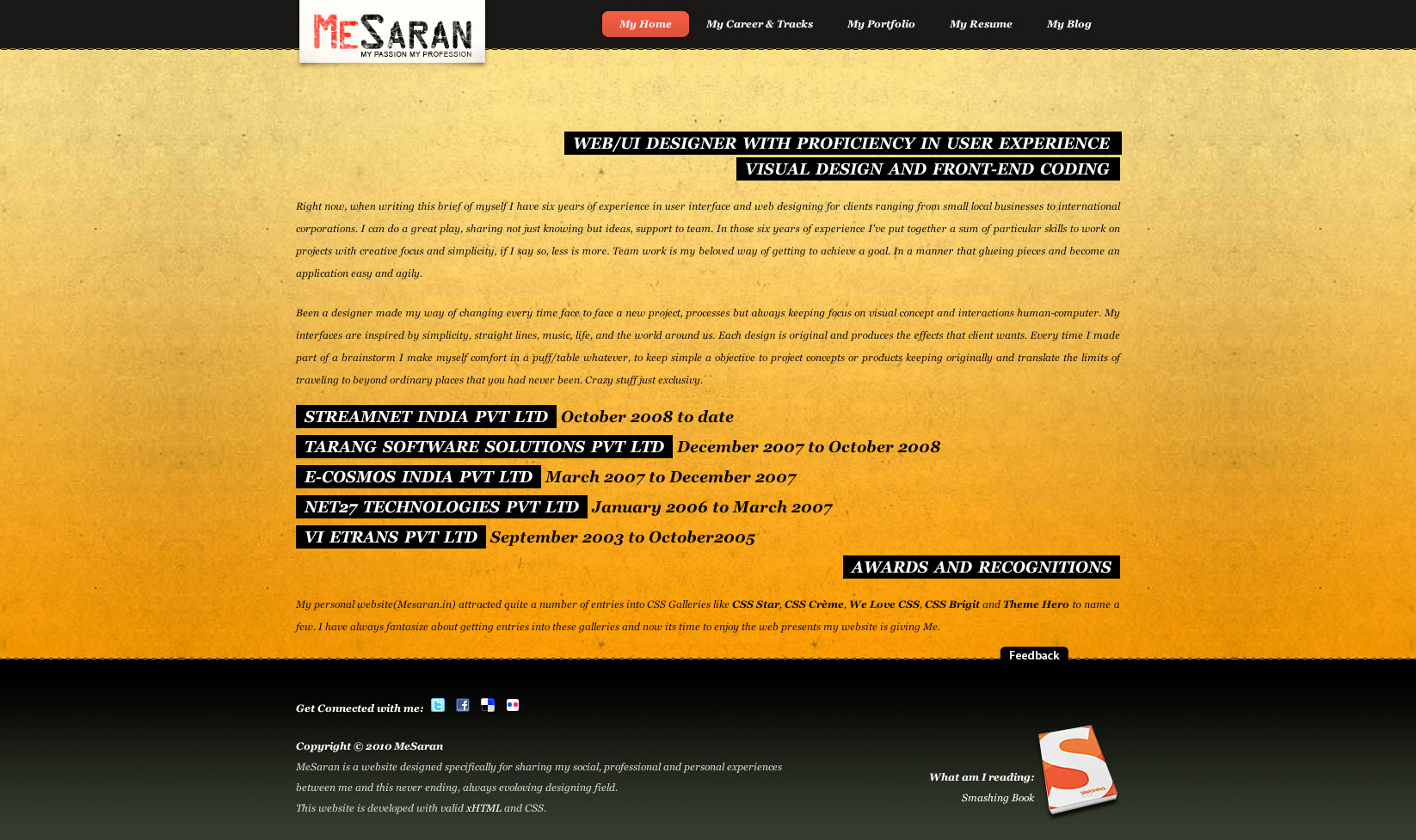
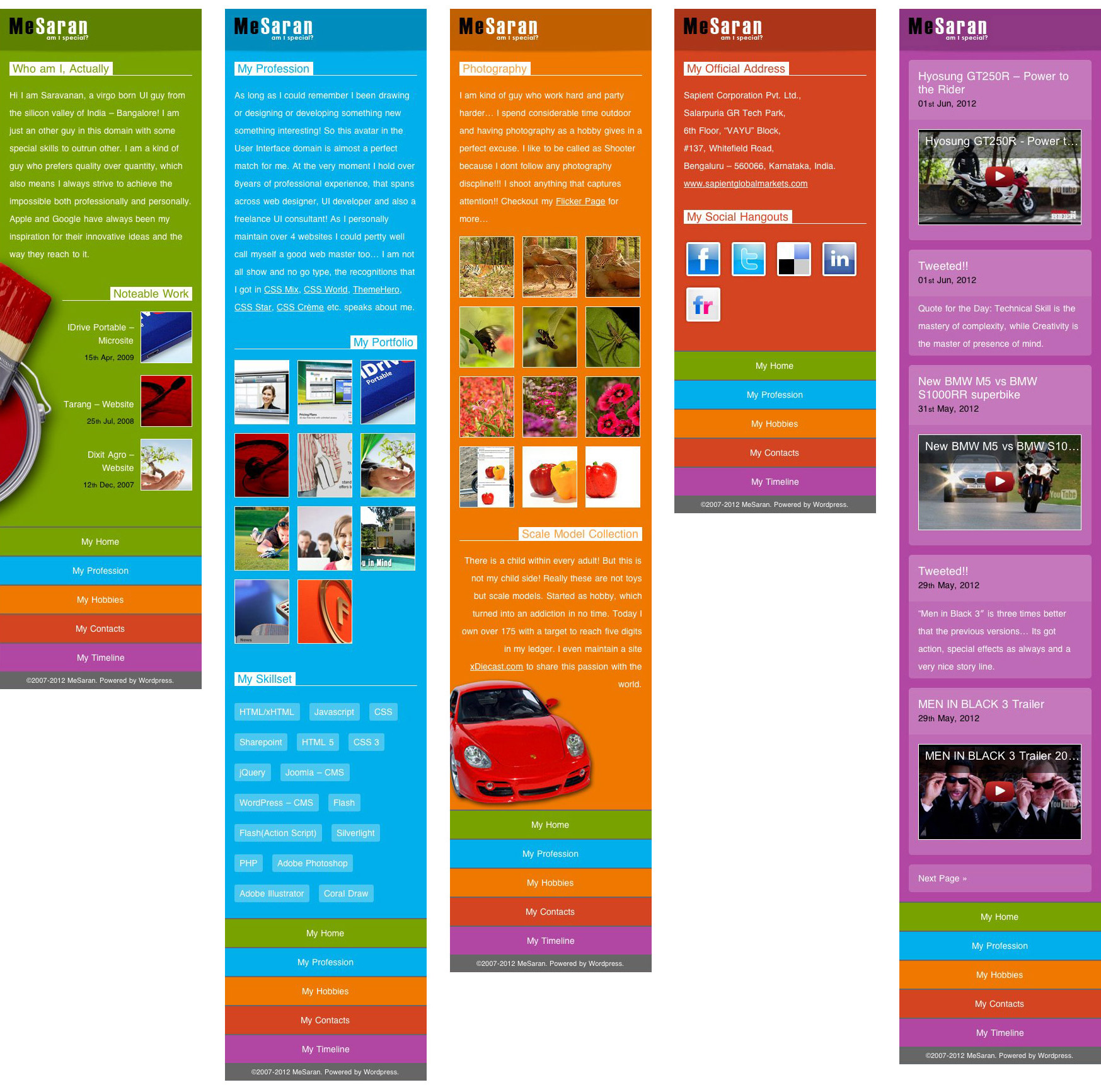
Home Page
The current home page had all the content that are associated with a typical personal website but our heat map showed us that the users are confused and go back and forth before landing on a desired page. Also from our feedback session with a close bunch of friends revealed that the page is bit too long and some content like the “blog post” is not exciting them any more. So we decided to move few component out!
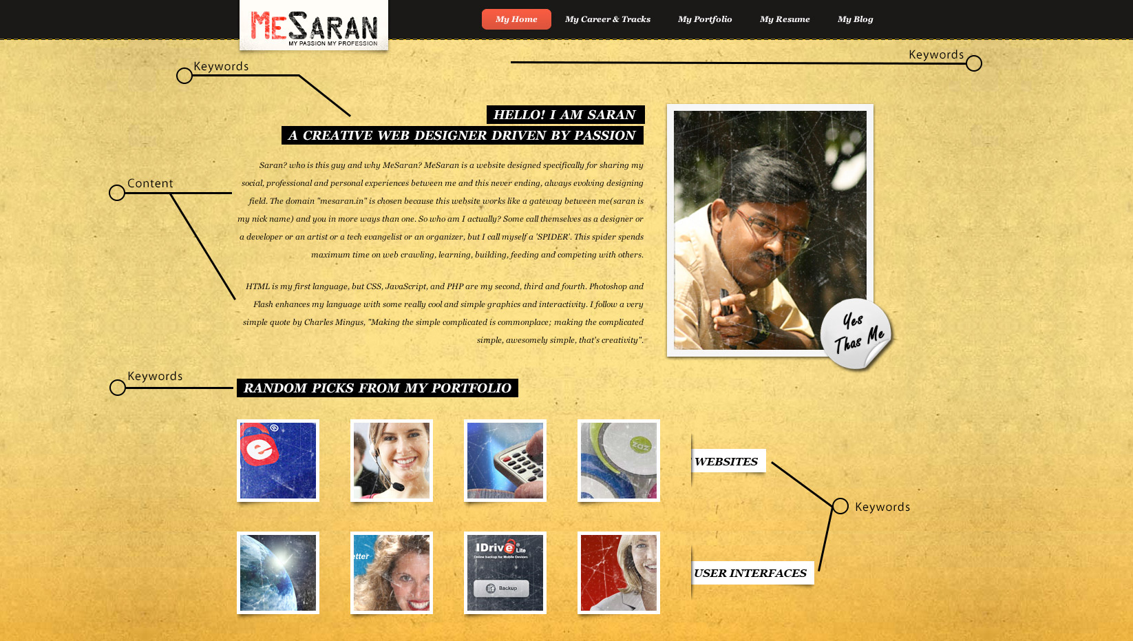
The new design took few iteration to get this final version. In this version 3.0 we decided to put a massive graphics that acts as an anchor point and everything pivots around this centre piece. The background looks like a folded sheet of paper and some color strips acting as a navigation menu. Also the tweets section is moved up to give it more emphasis to my twitter engagements. As tweets go passed sliding, the animation made it even more prominent.
Text content for the entire page is rewritten so to make it bit more crisp. We also reduced the number of featured work from eight to four so you see less. Yeah less is more here for sure and the same improved user engagement time. We also updated the footer content as the trend of big footer is losing plot, so we only some basic legal information and rest all removed.
Career Page
In the current site work related information is split into three pages, which not only created some confusions but also lost engagements. “My Career & Tracks” page is all text so this needed some block and graphics to break the monotony… This is feedback that almost users felt. My work history dint excite anybody so as the awards section, which again is losing plot as these CSS featuring is no longer considered legendary as they used to be.

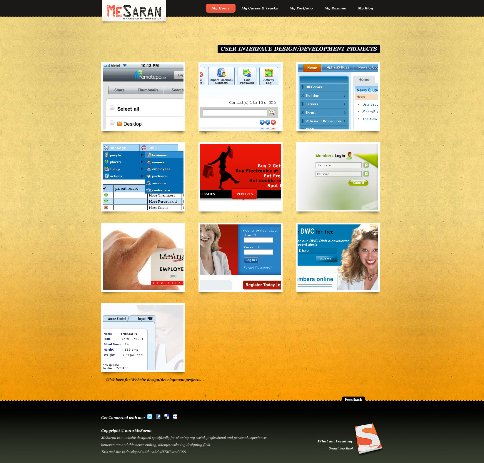
The portfolio page is also a separate page, which some user said is a overkill! And the way these are stacked, this also created some information flow issue. This page looks more like a product catalogue page so needs some updates. The portfolio section is broken into two one for “Website” and one for “User Interface” but there is no segregation, which needs immediate fix.
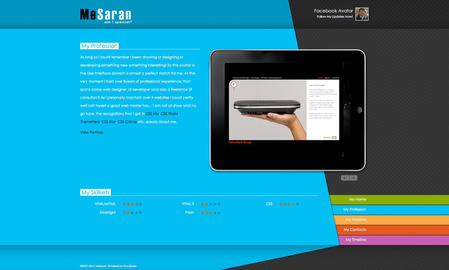
The new design irons out all of the known issue and page is far more usable and crisp. This page gets a massive iPad for showcasing featured work and link to show all the other work in a portfolio section. We also introduced a new section showcase skills with start rating. The text content is rewritten, which feels easier to take in.
Contacts
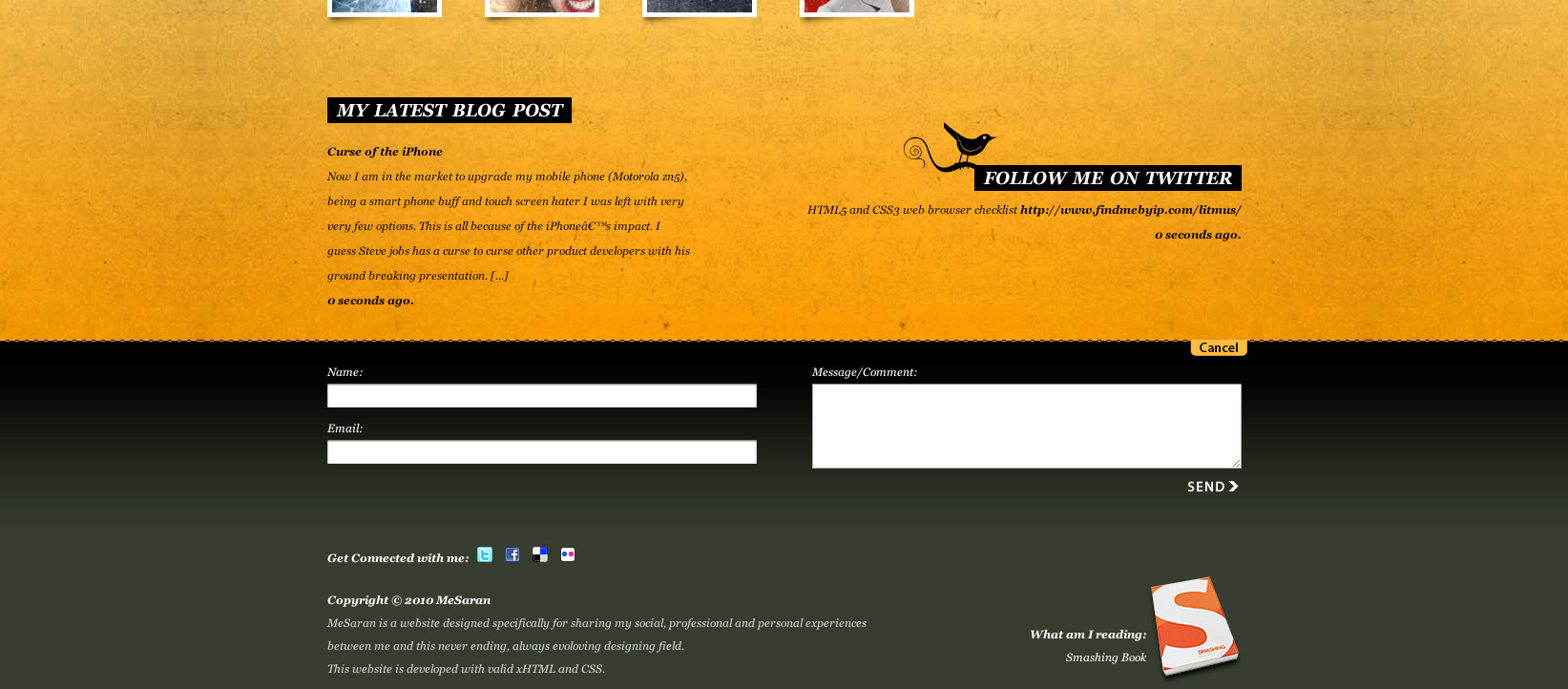
The current website has no dedicated section to get in touch with me, but the contact us form is buried inside the footer, which most of our user dint not find. So we need to do something to fix this. Also some of our user mentioned that putting up a physical address give bit more confidence.
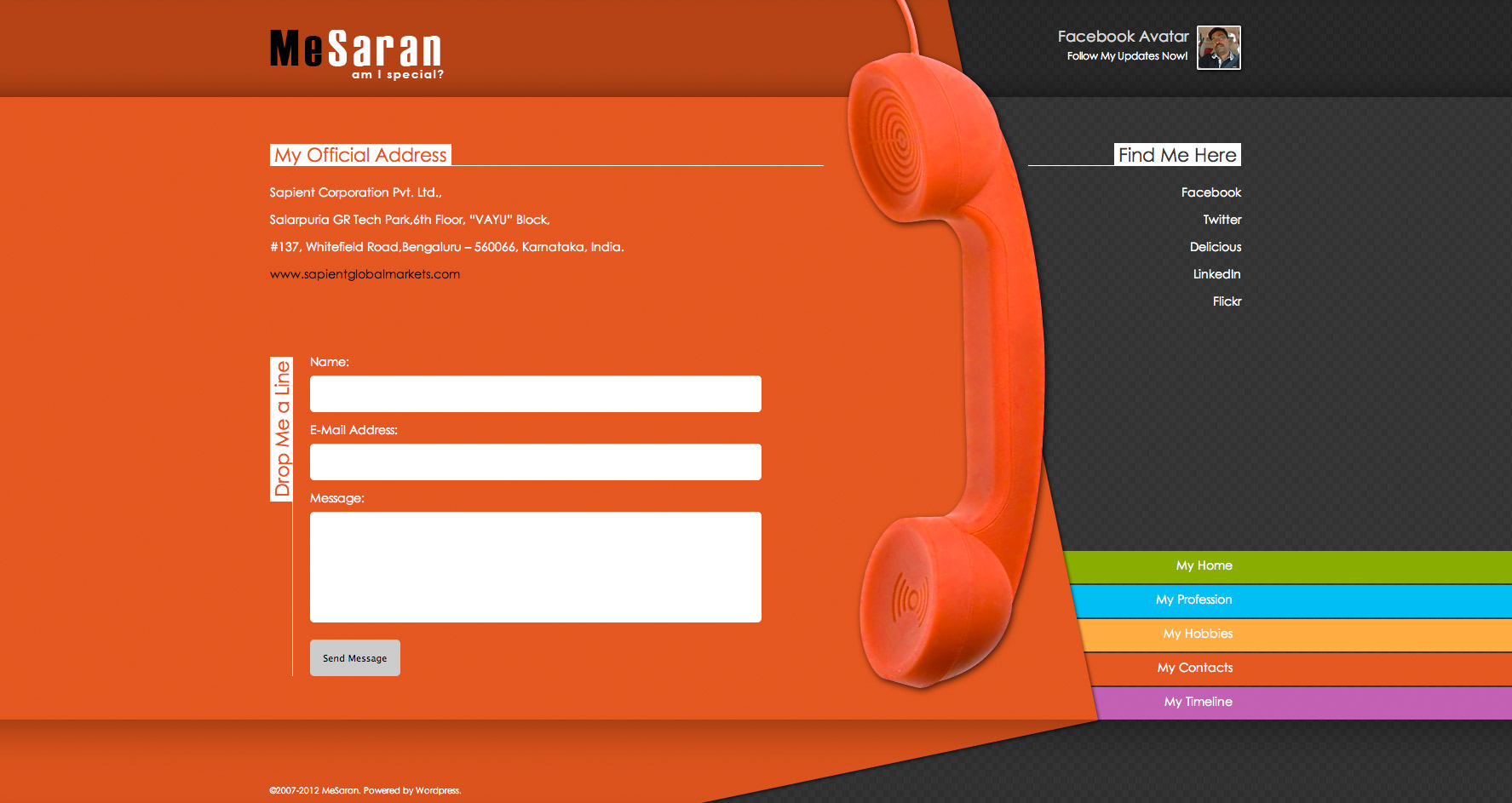
We created a new section to put my contact information, which includes a contact us form, my office address is displayed as well. We even added a separate section put up my social handles.
Hobbies
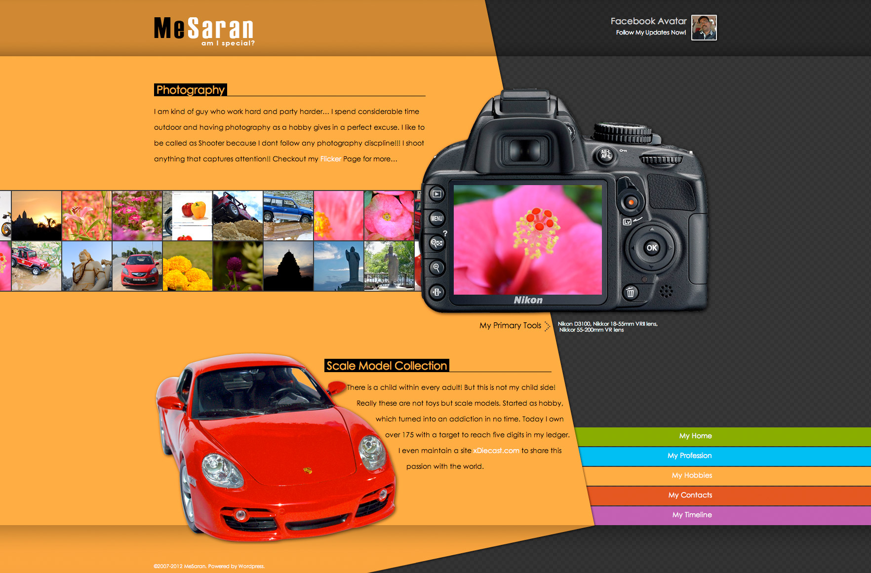
To add a bit of personal touch, we added a separate a page talk about my hobbies. The design language is cheerful so we added a direct feed from Flickr and placed like a film strip, which will become a centre piece of the page. My other hobby of collecting diecast scale models also gets a note, which I wanted.
MeSaran 3.0 – Mobile Version
Mobile version for this website is something that is a far cry and this time we decided to make it happen. The mobile version is kind of a stripped down version of our WordPress theme so the content is reused but the design adapts to work well in a smaller mobile screens. The design follows a long single column structure and menu at the bottom so that the user will explore the entire site before making a switch to the next page.
Outcome
SEO as mentioned worked out of the box. It performed even better with the new design with content that is to the point and segregated into their own space. This new design is bright and emphases the theme of the page even without reading a single word in the page. The bigger image also solved the purpose of demarking the content. “My Timeline” is a new addition and it worked so well thanks to its Facebook timeline inspired design. This page had become the user top favorite right behind Home page. Social integration with Flickr, Tweeter, Facebook and Delicious improved our engagements numbers better than what we expected.
Lessons learned
Mobile experience was good far better than the existing site but sill not upto the mark! This is mostly due to one major flaw, which is massive graphics that was designed to work as center piece dint work that great in mobile so need to be used a secondary piece. In our initial feedback session, most user felt that mobile UX can be better as they have seen the desktop version. But when we showed the mobile version alone this numbers dint took a toll as it initially did! Also, the Menu at the bottom came up as a experience killer but the idea of having it at the bottom it to force the users to get the full experience of the page. We may update these features soon if the analytics supports these facts.